
Web App UI Kit for Figma
A comprehensive Figma design system made for rapid iteration
Buy the UI Kit Preview in Figmav1.1

3600+
Responsive Components
Auto layout & variant support

130+
Predefined Styles
Text, color, and effect styles

150+
Interactive Components New!
Configured for faster prototypes

9pm
Dark Mode
Just flip the switch

For Product Designers
Deliver projects faster with a consistent framework of flexible Figma components. Prototype your solutions at scale and give development teams a solid foundation that communicates customer value.

For Product Managers
With more non-designers joining the fun in Figma, a well-organized, easy-to-use component library and UI kit is crucial for cross-team collaboration. Work in tandem with designers, validate ideas more efficiently, and plan product roadmaps with confidence.

For Startups & Entreprenuers
Articulate big ideas by prototyping in Figma while maintaining consistency across projects. Speak the same language as designers and communicate with everyone at the table responsible for product decisions.
💡 Core Components
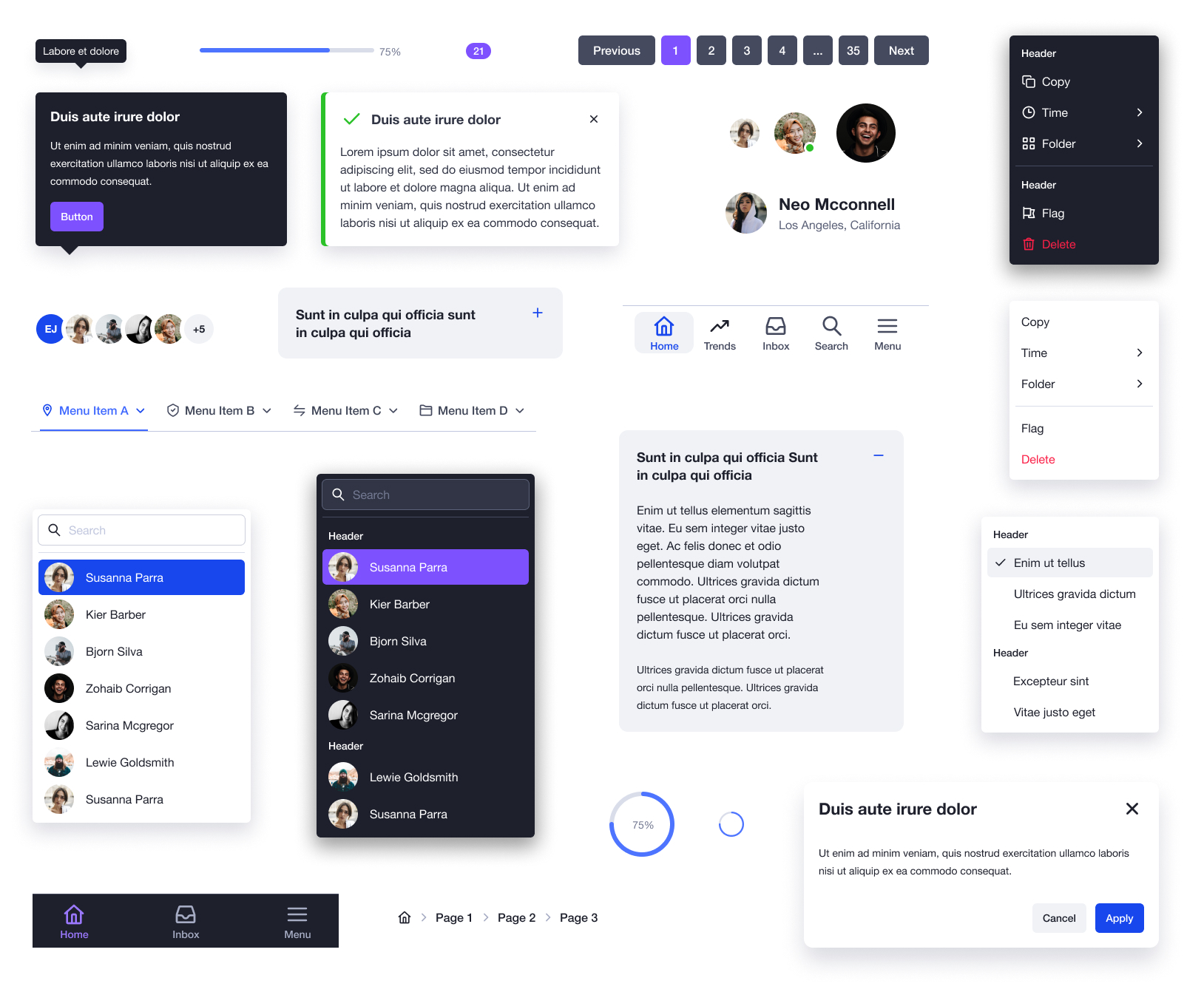
The UXBin web app UI core Figma components are a solid base for any interface. Quickly build unique interactions, and fine-tune the foundation of your app design while utilizing the Figma auto layout feature.
-
Accordion ⚡️
-
Badge
-
Breadcrumb
-
Divider
-
Menu
-
modal
-
Pagination
-
Popover
-
Progress
-
Scrollbar
-
Tab
-
Toast
-
Tooltip
-
User
-
User Group
🖊 Form Components
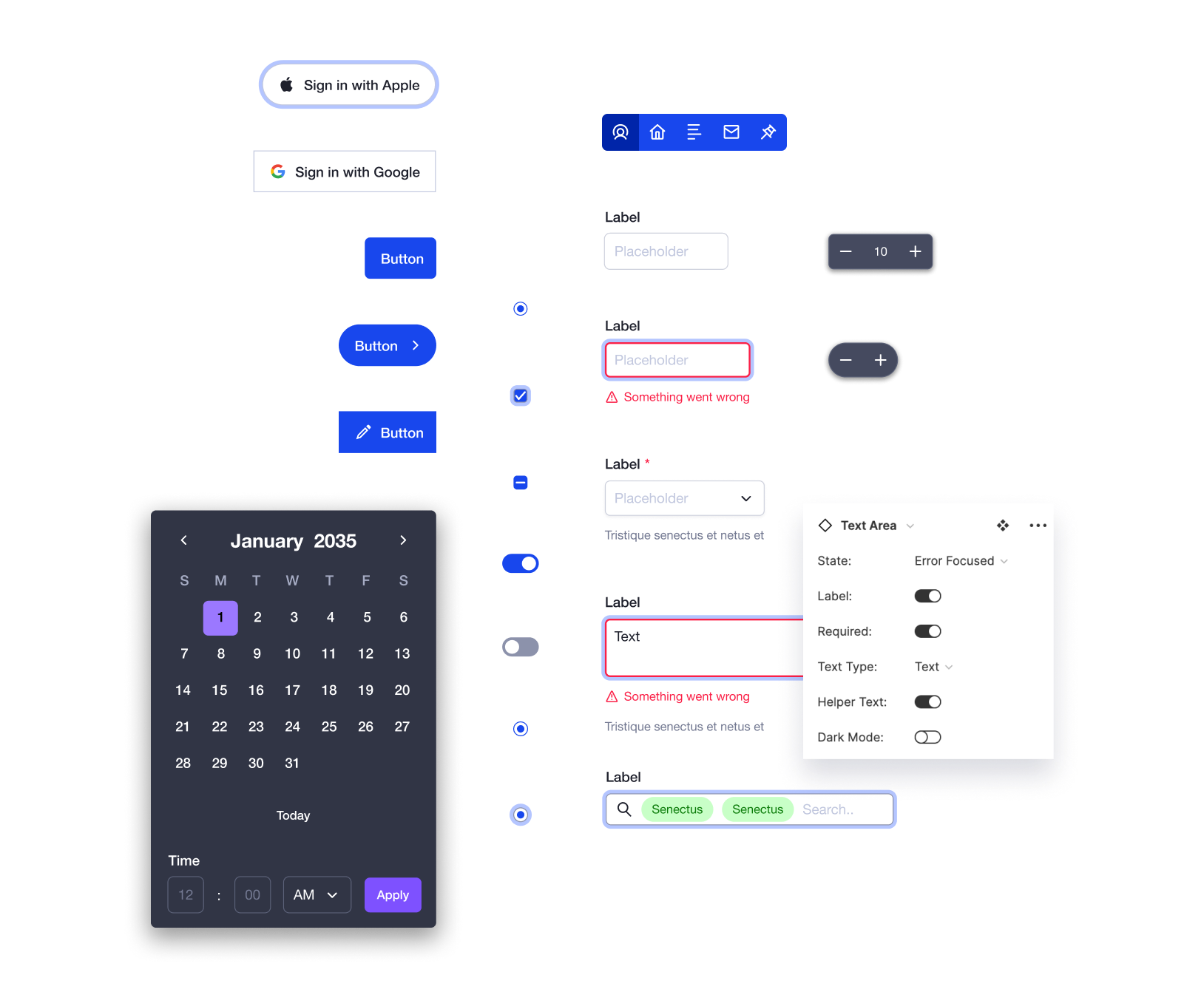
Construct well-documented, easy-to-use form components with precision and clarity. Manage the state between interactions with one click and ensure you never forget an error state again.
-
Button ⚡️
-
Button Group
-
Button Sign in with (SSO) ⚡️
-
Checkbox ⚡️
-
Date Picker ⚡️
-
Dropdown
-
Input ⚡️
-
Radio ⚡️
-
Slider
-
Stepper ⚡️
-
Switch ⚡️
-
Tag
-
Tag Input ⚡️
-
Text Area ⚡️
🔮 Library Styles
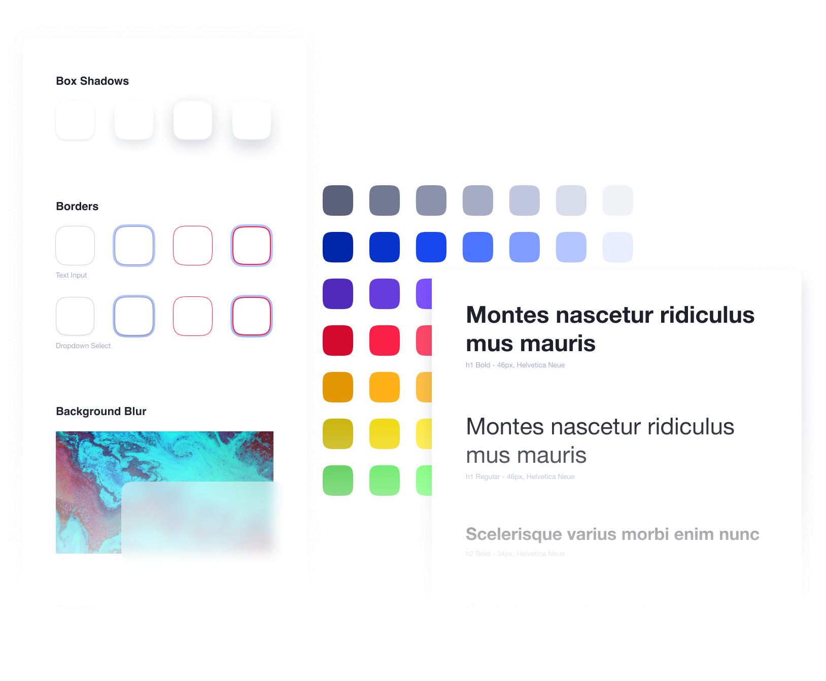
Manage your branding colors, text styles, and component effects from one central space. This Figma style library uses a simple, easy-to-use structure that designers can customize to fit any storyline.
-
Text sizes and weights
-
Colors and gradients
-
Box shadows and borders
-
Background blurs and overlays
🍱 Table & Chart Components
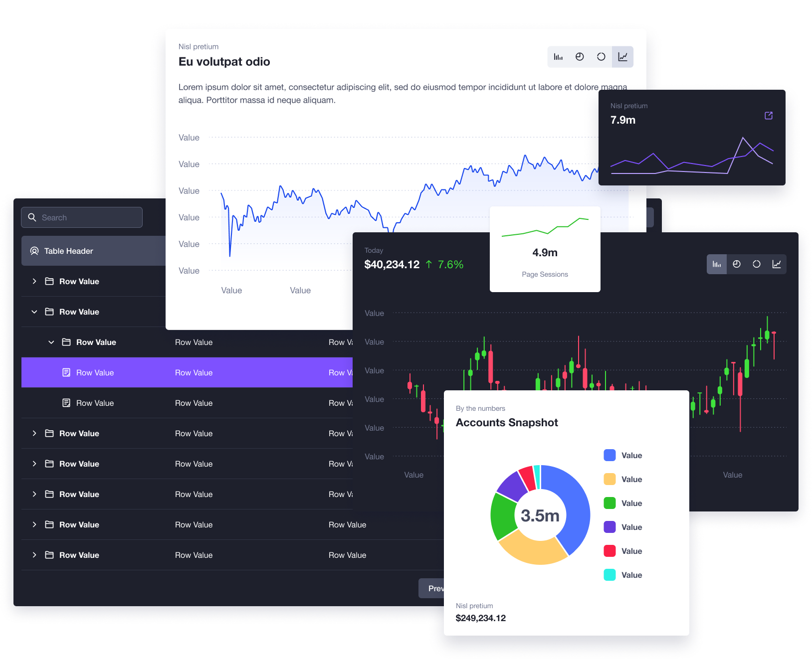
Easily create beautiful tables and charts that can automatically adapt for different screen and window sizes. Give anyone the ability to show information and data in a structured framework. Detach the instance for complete customization and flexibility.
🎬 26 Starter Templates
The UXBin web app UI design library includes 26 different examples of app-specific pages. All included templates use the design system with a hint of customization and personalization.
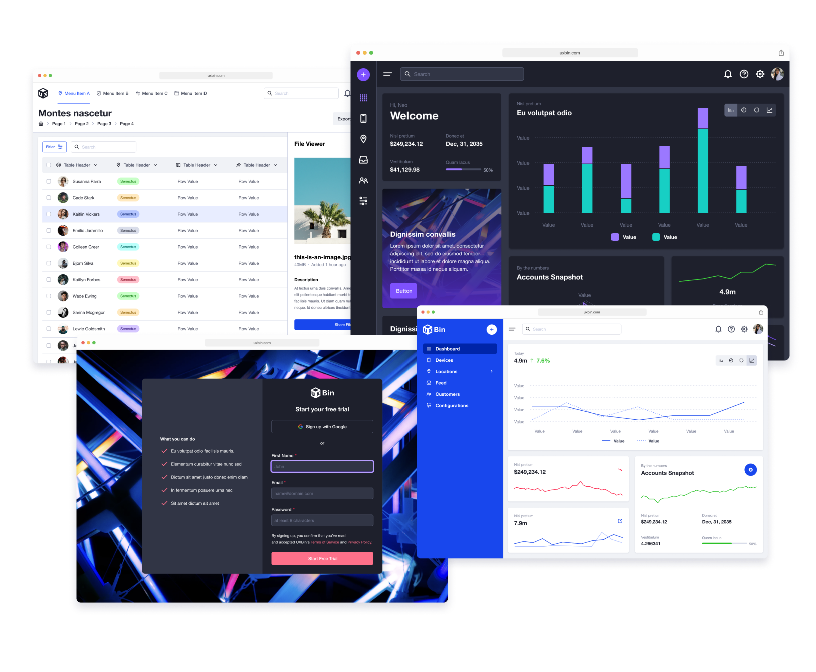
A Figma design system that makes sense
The UXBin web app UI design library uses a streamlined approach to file organization so Figma users no longer have to deal with a bloated design system. Designers can use a common element and change the variant properties. For example, the button is one component in the library, but it has 960 variants already mapped to it.
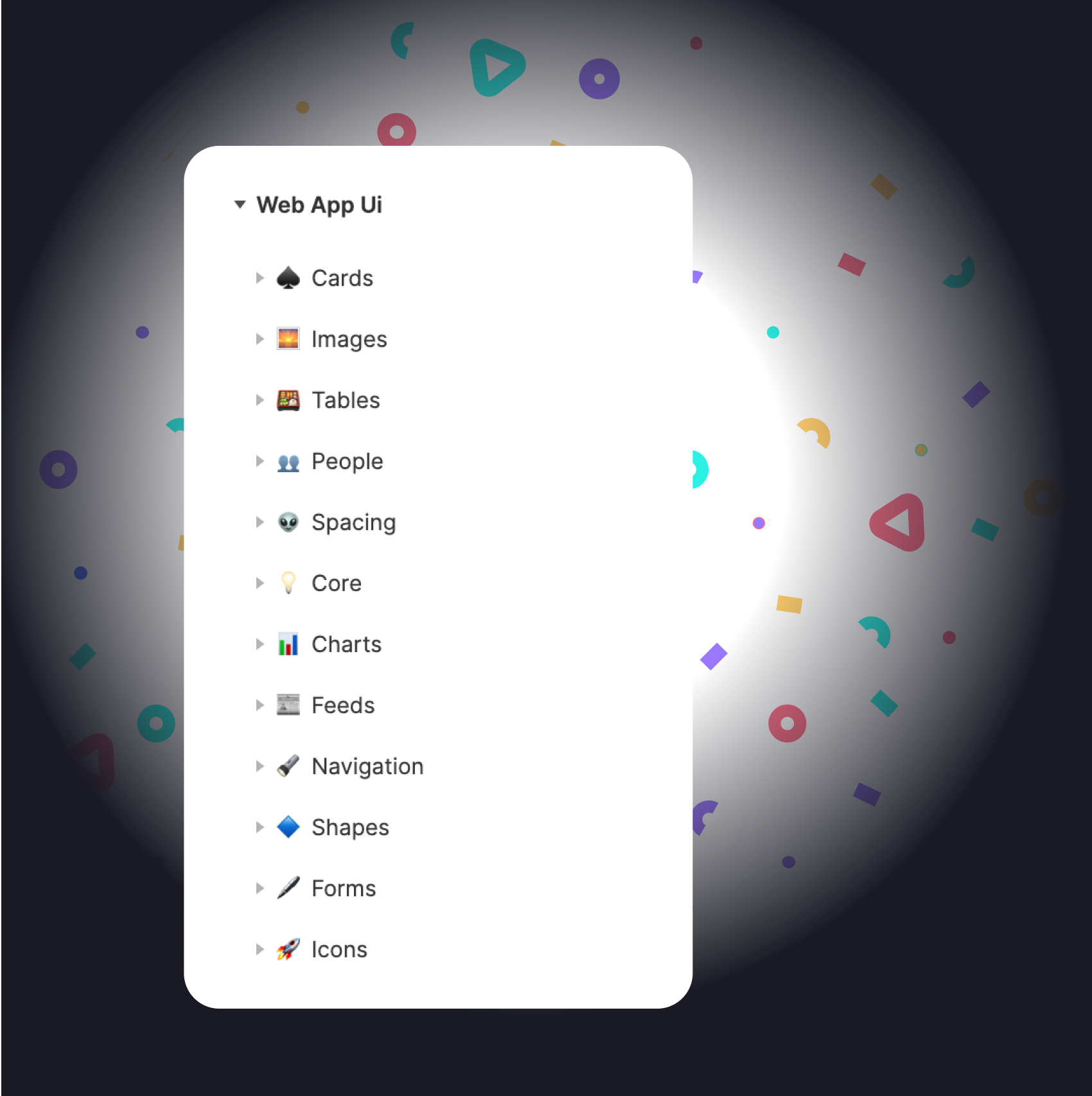

Build prototypes on the fly
Focus on solving problems and building value for users. Style and feel are essential, but easily validate ideas using Figma for mockups and prototypes first!

Dev teams in mind
Design with your development and engineering teams on board. Convey Figma prototypes with components based in reality.

Never start over
Starting a new project can be daunting if you have to recreate everything from scratch. Just turn on the library and hit the ground running.

Consistency is key
When collaboration is happening in different parts of the product, having a single source of truth brings everything together. Common UI kit componenets are key.

Free updates
Automatically get access to file optimizations, new components, and new styles. When Figma updates, the UXBin web app UI component library update.
Get everything for yourself or your team
What's included:
-
150+ Interactive Components New!
-
3600+ Responsive Components
-
Auto layout & variants
-
130+ Text, color, and effect Styles
-
26 Starter Figma templates
-
Dark & light modes
-
180+ Unique UI icons in two sizes
-
100% Control for commercial use
-
Free updates

Single
For individuals & freelancers
- Single editor - One time purchase


Team
For startups & product teams
- Unlimited editors - One time purchase
Frequently Asked Questions
Interactive components are a fantastic feature in Figma that allow for faster prototyping. Read more
Yes. If you have a single or team license, you have complete control, and you may customize each component to your liking. You are not allowed to rebrand or resell the components as another library or UI kit.
No. If you purchased a team license, you are good to go for unlimited editors, now and in the future.
If you purchased a single license in the past and now want a team license, reach out to us at hello@uxbin.com. We will hook you up with a better option.
Our full license agreement is located here.
Basically, you are free to use, manipulate, and change any part of the library as it relates to your personal and commercial projects. If you are using the files as an individual or freelancer, we recommend the single license. If you are interested in collaboration and want multiple team members to use the library, we recommend the team license. You are not allowed to rebrand or resell the components as another library or UI kit.
We use LemonSqueezy to process payments. When you checkout, you enter an email address that is used for file delivery and future updates. We will notify you via email with a new Figma (.fig) file once available.
If you are having issues receiving email notifications from UXBin, please do not hesitate to email us at hello@uxbin.com for further assistance.
We use LemonSqueezy to process payments. Currently, we can accept Discover, Visa, Mastercard, AMEX, Diner's Club, and PayPal.
Yes. After your purchase has been completed, you can print your own invoice by clicking the link at the bottom of your receipt. If you are experiencing issues or need assistance, please reach out to hello@uxbin.com.
Unfortunately, we cannot offer refunds at this time for our electronically delivered products.
We love to hear from our customers. Please contact us at hello@uxbin.com and let's work together!
Join the UXBin Community
Subscribe for exclusive discounts, updates, and new products!
